
Most eCommerce business owners we talk to have the same goal: “We need more website visitors.” We need more sales.”
But here is the honest truth: if your store has a “leaky bucket,” bringing in more people won’t help you grow.
When we talk about a leaky bucket in eCommerce, think of the water as your potential customers and the bucket as your website. You might be spending a lot of money on ads and social media to “fill the bucket” with visitors, but if your website is confusing or slow, those customers “leak” out of the holes before they ever make a purchase.
In 2026, online shoppers have very little patience. If your site makes them stop and think for even a second, they will likely leave and shop with a competitor. You don’t necessarily need a bigger crowd; you need a smoother path from the homepage to the checkout.
The Stats Behind the Leak
To understand how much money is potentially being left on the table, we have to look at the industry averages:
Conversion Rate:
This is the percentage of visitors who actually buy. Across the board, a “good” conversion rate is usually between 2% and 3%. If yours is below 1%, your bucket has a major hole.
The Mobile Gap:
While desktop conversion rates often hit 3% to 4%, mobile rates usually struggle at around 1.5%.
Drop-off Rate:
This is where people quit. In eCommerce, the average Cart Abandonment Rate is a staggering 70%. That means for every 10 people who like your product enough to add it to their basket, 7 of them leak out before paying.
In 2026, you don’t necessarily need a bigger crowd; you need a smoother path from the homepage to the checkout.
Here are 5 simple ways to stop losing sales and make your online store much easier to use.
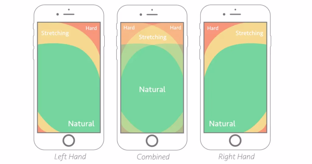
1. Think About the Thumb
I’ll let you in on a secret: Even though I work in this industry, whenever I need to book a flight or make a big purchase, I almost always switch from my phone to my desktop….
If you do the same, it is completely normal. :-)I There is a huge difference between browsing (scrolling for inspiration while on the sofa) and buying (the “serious” part where you commit your money).
This gap is exactly why mobile conversion rates (the percentage of people who actually finish a purchase on their phone) are usually half of what they are on a computer. People “window shop” on mobile but often “leak” out of the bucket because the screen feels too fiddly for the final step.
The Reality:
Most people browse one-handed. If your “Add to Basket” button is at the top of the screen, it’s in the “Danger Zone”.
It means it’s hard to reach without shifting your grip. This “fumble factor” is why many people give up and wait until they are at a desk to buy. The problem? By the time they get to their desk, they’ve often forgotten or changed their mind.
The Fix:
Move your “Add to Basket” and “Checkout” buttons to the bottom of the screen. By keeping them in the “Green Zone” (the natural arc where a thumb sits) you make the act of buying feel just as safe and easy as it does on a desktop.
2. Help Your Search Bar “Understand”
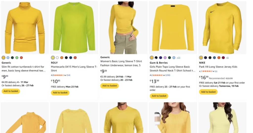
I recently had a “dark web” experience on a major shopping platform. I was looking for a simple yellow long-sleeved T-shirt for a Minion carnival costume. You would think that’s an easy find, but it took me 45 minutes of digging through irrelevant results just to find one.
When your search bar doesn’t “understand” what a human is actually looking for, it turns a quick shop into a chore. Most customers won’t give you 45 minutes; they’ll give you 45 seconds before they leave.
The Reality:
Traditional search tools look for exact matches. If a customer types “eco-friendly trainers” but your product is titled “Green recycled wonderful comfortable shoes,” the search might fail because the name is too fluffy.
Even worse is keyword stuffing, where a title looks like: “Running Shoes Sneakers Athletic Gym Trainers Men’s Women’s Blue Gift Idea.” We have all been there! You click on a result like that only to find the product is nothing like what you actually wanted. It’s frustrating for the user and confuses modern search tools.
The Fix:
Use “Semantic Search” tools that understand intent and synonyms. At the very least, make sure your “No Results” page isn’t a dead end. It should automatically show your bestsellers or trending items to keep the customer browsing even if the specific search failed.
What is Semantic Search? Think of it as a store assistant who actually listens. Instead of just looking for exact words (like “yellow”), it understands the intent behind your search. It knows that “lemon,” “amber,” and “gold” are all types of yellow, helping customers find what they need even if the product name doesn’t match their search perfectly.
3. Avoid “Choice Overload”
I recently went to a major sporting goods site to buy a pair of ski gloves. I was met with 350 different options. Instead of feeling like I had a great selection, I felt overwhelmed. How do I know which one of those 350 is actually right for me?
When you give a customer too many choices without a clear way to narrow them down, they experience “decision paralysis” and leave.
The Reality:
It’s tempting to show off every product variation you have, but a wall of 350 items is exhausting for your customers. The best design feels invisible. The customer should feel like they are being guided to the right product, not lost in a warehouse.
The Fix:
Use “Smart Filtering.” Instead of just listing 350 gloves, ask the customer simple questions: Is it for sub-zero temperatures? Do you need them to be waterproof? Keep the initial interface clean and only show advanced technical filters if the user asks for them. This keeps the experience focused and helpful.
4. Give Instant Feedback
I recently ended up buying four concert tickets instead of two because of a slow website. I tapped the “Confirm” button, nothing happened, so I tapped it again. And again. By the time the page finally loaded, the site had processed my order twice…. Been there?
On a mobile screen, if there’s even a split-second delay without a response, users assume the site is broken or their tap didn’t register. This leads to double-orders, frustration, and a massive headache for your customer and your support team.
The Reality:
Your store needs to feel “alive.” On a phone, we don’t have the “hover” effect of a mouse to tell us a button is clickable. If a button doesn’t change colour or pulse the moment it’s pressed, the customer loses confidence in the transaction.
The Fix:
Add subtle animations. A button that changes shade when tapped, or a loading spinner that appears instantly, tells the customer: “I heard you, I’m working on it.” This simple visual cue prevents double-tapping and keeps the user calm.

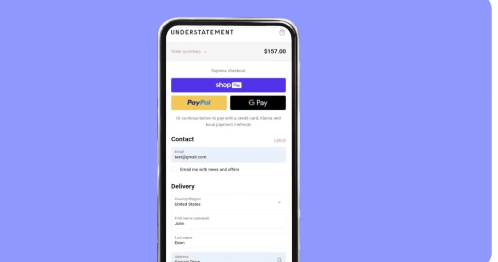
5. The “Invisible” Checkout
We’ve all been there. You find the perfect item, you’re ready to buy, and then you hit the checkout wall.
I’ve genuinely abandoned carts because the form was so long I expected it to ask for my grandfather’s birthdate, my aunt’s maiden name, and the name of my first pet just to let me buy a pair of socks.
If you make a customer work too hard to give you their money, they simply won’t. In 2026, a long form isn’t just an inconvenience. It’s a deal-breaker.
The Reality:
Every extra box a customer has to fill in is an opportunity for them to change their mind. This is the primary reason people flee to their desktops; they want a real keyboard to tackle the “interrogation” you’ve put in their way.
The Fix:
Prioritise “Express” buttons like Apple Pay, Google Pay, or Shop Pay and put them at the very top. If you must use a form, use “address look-up” so they only have to type their house number and postcode. The goal is to make the checkout so fast it’s practically invisible.
Stop the Leak, Start the Growth
At the end of the day, eCommerce isn’t just about moving products; it’s about trust and momentum.
When I’m digging through 350 pairs of gloves or accidentally buying double the tickets I need, my momentum stops and my trust in the brand leaks away. Every time a customer has to “wait until they get to a desktop” to finish a purchase, you are handing them a pair of scissors to cut the thread of that sale.
You don’t need a massive marketing budget or a total website redesign to see a difference. By plugging these five holes:
- Making the “Add to Basket” thumb-friendly.
- Fixing “fluffy” or stuffed search results.
- Guiding customers through choice overload.
- Giving instant visual feedback.
- And making the checkout nearly invisible.
…you stop the leaks. You’ll find that you don’t actually need more “water” (visitors) to fill your bucket—you just need a bucket that actually holds what you’re pouring into it.
FAQs
Not anymore. In 2026, you don’t need to build this from scratch. Most major eCommerce platforms have apps or plugins that use AI to handle synonyms and intent automatically. It’s usually a “plug-and-play” fix that replaces your basic search bar with a much smarter one.
Not if you use Responsive Design. Your website should be smart enough to know what device is being used. On a desktop, the button stays in its traditional spot. On a mobile, it “sticks” to the bottom of the screen. This ensures the best experience for both types of shoppers.
This is a common worry, but the reality is the opposite. These services securely pass the customer’s name, email, and shipping address directly to your system. You get the same data you would from a manual form, but without making the customer do the typing. It’s a win-win.
The best place to start is your Analytics. Look for your “Drop-off Rate.” If thousands of people are adding items to their baskets but only a tiny fraction are checking out, your “leak” is likely in the checkout forms or mobile button placement. If they search and then immediately leave, your search bar is the culprit.


Leave a Reply